Xboxaddict.com Article
Gears Tactics - The Art of the Game
by Josh Morgan
Titan Books has a fantastic track record of putting out excellent quality art books for games, and the Art of Gears Tactics is no different. It's always interesting to dive into one of these books and see all the changes that have taken place over the course of development of our favorite games. With the Art of Gears Tactics, it offers even more because the newest game of the series drops the third person cover shooter gameplay in favor of isometric strategy. This art book covers the design process and it tells how developer Splash Damage tows the line of old and new while keeping it's "Gearsiness". If you want to learn more about Gears Tactics for PC check out our full review HERE. We will also be reviewing the Xbox Series X version coming out this fall when it releases.
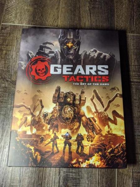
Full disclosure; Titan Books sent XboxAddict a copy of this art book to assess and ‘review'. While we may not give a traditional score, everything in this article will give you an in-depth look at what you can expect should you want to purchase it for yourself, or someone else for a fantastic gift. I would suggest playing through Gears Tactics before delving too deep into the reading of the art book, as there are some minor, and possibly major, spoilers to be had. The art book assumes you've played the games already and want to learn more after the fact.
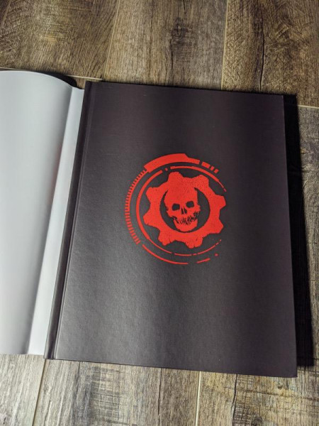
The dimensions of the book are your standard 12" tall by 9" wide making it the perfect fit with your other art books on the shelf. As I removed the dust cover, I swear I heard the collectible chime from the game as I exposed the matte black cover with the crimson omen. Coming in at 192 beautiful glossy pages and split up between 3 Acts (just like the games), you can spend a few hours reading the notes and looking at the detailed pictures of the design process of characters, locations, enemies and cut scenes. I'll dive a bit deeper into the contents of each Act further down (except Act III which is full of spoilers), but one thing that I wanted to focus on was the smell.
You might laugh that I am writing about the smell of a book, but I am guessing as soon as I mentioned it, you could almost smell it yourself. That smell of a brand new book, cracked from its plastic seal, and as you fan the pages in front of your face it takes you back to a simpler time when you were a kid in a comic or collectible store. For me it triggers something new, fresh and exciting that I get to dive into. I wanted to simply write "The pages smell fantastic. Buy it!" as my review, but someone who will remain nameless said it was unprofessional.
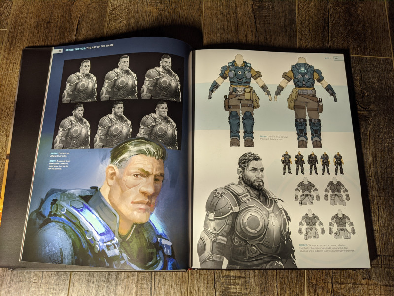
Act I covers the characters, locations and enemies that you encounter in Act I of the game itself, but to avoid spoilers associated with locations and enemies I will focus on the character designs of Gabe and Sid. I've always found the evolution of character design interesting and this art book kept me turning the pages by showing me enough of the design process to really get what the artists had in mind while creating these characters. Gabe, for instance, had gone through a few changes in hairstyle, armor and scarring before they decided on the final model. They wanted him to look young enough to want to fight for his people, yet old enough to show experience and the scars helped tell his story. Sid went through a pretty drastic transformation during his creation process also. At one point he was going to have a nickname of "Blind Sid" and one of the character models show him with both eyes bandaged, and another shows him with both eyes exposed and having all white eyes showing the loss of sight. Act I takes up almost 50% of the book and showcases a bunch of characters, locations, and vehicles. There's even a few pages on that turd Prescott.
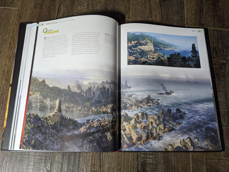
Act II shows off the location of Vasgar, which you might remember from Gears 5 and its sporadic lighting that changes sand into glass that is sprouting up from the ground. The Vasgar of this time period is 40 years younger before the sea dried up, so we get to see what the large location looked like before the events of Gears 5. The team referred to it as the Vasgard Coast as it was ultimately inspired by Mediterranian coastal geography, and flipping through these pages you can see why. It almost looks like Kings Landing from Game of Thrones; a very large castle or keep set atop a steep, almost vertical ridge that butts right up against the water line. Then as you travel further away from the coast you are shown the desert setting of Vasgard that you may be familiar with. Act II also has a few pages dedicated to the Corpser, the giant spider enemy with a missle backpack. The pages for the Corpser talk about the design challenges with displaying the boss battles from a top-down isometric perspective rather than the up in your face camera angles they have used in the traditional Gears games.
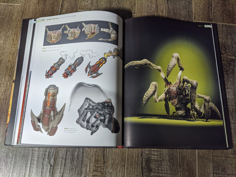
The Art of Gears Tactics was written by Greg Juby who is the Art Director at the Coalition and published by Titan Books who, as I said earlier, has an amazing track record of producing high quality artbooks for the fans of many games. It retails for $45 USD and $59 Canadian Monopoly money and I believe that it is very worth the price that they set. It will look great on your bookshelf, and on your coffee table, but it's best kept under your nose so you can get all those good quality smells in. It smells fantastic, buy it!
ISBN: 9781789095074
Format: Hardback
Pages: 192
Published: April 28 2020 (US)
Dimension: 11.88" x 9.00" (US)
All images ©Microsoft
